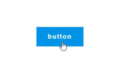
整体效果

💎知识点:
1️⃣ :before 以及 :after 伪元素
2️⃣ transform 以及 transition 属性
3️⃣ flex 布局以及 position 定位
4️⃣ :hover 选择器
🔑思路:
定义好按钮通用样式,然后利用伪元素绘制两个矩形背景,当鼠标悬浮在按钮上方时,两个伪元素矩形背景过渡显示出来。
一个双开门的按钮,交互效果比较强,但是实现很简单,快学起来吧。
核心代码部分,简要说明了写法思路;完整代码在最后,可直接复制到本地运行。
核心代码
html 代码
1
| <button class="btn69">button</button>
|
button 主体。
css 部分代码
1
2
3
4
5
6
7
8
9
10
11
12
13
14
15
16
17
18
19
20
21
22
23
24
25
26
27
28
29
30
31
32
33
34
35
36
37
38
39
40
41
42
43
44
45
46
47
48
49
50
51
52
53
54
|
.app {
width: 100%;
height: 100vh;
background-color: #ffffff;
position: relative;
display: flex;
justify-content: center;
align-items: center;
}
.btn69 {
width: 120px;
height: 50px;
background-color: transparent;
color: #333333;
font-size: 16px;
font-weight: bold;
letter-spacing: 2px;
border: none;
cursor: pointer;
position: relative;
display: flex;
justify-content: center;
align-items: center;
z-index: 1;
transition: color 0.3s ease-in-out;
}
.btn69:before, .btn69:after {
content: '';
width: 0;
height: 50px;
background-color: #0093E9;
position: absolute;
top: 0;
right: 60px;
z-index: -1;
transition: width 0.3s ease-in-out;
}
.btn69:after{
left: 60px;
}
.btn69:hover:before,.btn69:hover:after{
width: 60px;
}
.btn69:hover{
color: #ffffff;
}
|
1、定义按钮通用样式,设置背景色为透明,设置 display: flex 布局,内容平行垂直居中,给 color 增加过渡参数。
2、利用 :before 和 :after 伪元素绘制出两个矩形背景,通过 position 定位两个伪元素矩形的位置到按钮中间,定义矩形默认宽度为 0 ,并且给 width 增加过渡参数。
3、通过 :hover 选择器,让按钮中的文字颜色在鼠标悬浮上方时变成白色;同样通过 :hover 选择器,让两个伪元素矩形在鼠标悬浮上方时宽度从 0 变成 60px 。
完整代码如下
html 页面
1
2
3
4
5
6
7
8
9
10
11
12
13
| <!DOCTYPE html>
<html lang="zh">
<head>
<meta charset="utf-8">
<link rel="stylesheet" href="style.css">
<title>双开门按钮</title>
</head>
<body>
<div class="app">
<button class="btn69">button</button>
</div>
</body>
</html>
|
css 样式
1
2
3
4
5
6
7
8
9
10
11
12
13
14
15
16
17
18
19
20
21
22
23
24
25
26
27
28
29
30
31
32
33
34
35
36
37
38
39
40
41
42
43
44
45
46
47
|
.app{
width: 100%;
height: 100vh;
background-color: #ffffff;
position: relative;
display: flex;
justify-content: center;
align-items: center;
}
.btn69{
width: 120px;
height: 50px;
background-color: transparent;
color: #333333;
font-size: 16px;
font-weight: bold;
letter-spacing: 2px;
border: none;
cursor: pointer;
position: relative;
display: flex;
justify-content: center;
align-items: center;
z-index: 1;
transition: color 0.3s ease-in-out;
}
.btn69:before,.btn69:after{
content: '';
width: 0;
height: 50px;
background-color: #0093E9;
position: absolute;
top: 0;
right: 60px;
z-index: -1;
transition: width 0.3s ease-in-out;
}
.btn69:after{
left: 60px;
}
.btn69:hover:before,.btn69:hover:after{
width: 60px;
}
.btn69:hover{
color: #ffffff;
}
|
凌尘k
于高山之巅,方见大河奔涌;于群峰之上,更觉长风浩荡。
本博客所有文章除特别声明外,均采用 CC BY-NC-SA 4.0 许可协议。转载请注明来自 凌尘k-Blog! 